
Shopify Hero Section: The Complete Guide (What Works, What Converts, How to Build One)
7 min read
The short answer
A Shopify hero section is the full-width block at the top of your homepage (or landing page) — the first thing every visitor sees. It's built from a theme *section*, which means you can replace it without touching the rest of your theme. The heroes that convert share three traits: they show a real product (not a lifestyle collage), they give the visitor exactly one thing to do, and they earn attention with motion or depth instead of a static banner. You can get there three ways: your theme's built-in hero, a hero section app, or a hand-coded custom section.
VOIDD builds the app route: cinematic, interactive SupaHero Sections that drop straight into the Shopify theme editor — install, pick a product, done. No code needed. Free to install: apps.shopify.com/voidd.
What a hero section actually is (in Shopify terms)
Every Online Store 2.0 theme is assembled from sections — self-contained blocks you add, reorder, and configure in the theme editor. The "hero" is just the section slotted first. That architecture matters because it means:
- You can swap ONLY the hero. No redesign, no new theme, no page builder wrapping your whole site.
- A hero shipped as a Theme App Extension (TAE) appears natively in the editor and uninstalls cleanly — nothing pasted into theme.liquid.
- Settings live in the editor sidebar: your product, your copy, your colors, no developer round-trips.
Why most Shopify heroes lose the sale
The average visitor decides in about 3 seconds whether to scroll. The default failure modes:
- The static banner. A stock lifestyle photo + "Shop Now." Visitors have seen it ten thousand times; it reads as template, and template reads as skippable.
- The carousel. Rotating slides split attention across 3-5 messages; slide 2 onward is effectively invisible. One hero, one message.
- The decorative animation. Floating shapes and fade-ins that never show the product. Motion without a subject is noise.
- The 4K autoplay video. Beautiful, and it torpedoes your Largest Contentful Paint — slow heroes lose more sales than ugly ones.
The pattern behind all four: the hero isn't doing the hero's job, which is presenting THE product like it deserves the top slot.
What a converting hero looks like
- One product, presented cinematically. The product is the subject — lit, centered or intentionally composed, with the scene built around it.
- One action. A single add-to-cart or shop CTA. If your hero has three buttons, it has none.
- Real commerce wiring. Variant switching, live price — including sale price with the struck-through original — and add-to-cart in the hero itself, so the visitor can buy without scrolling.
- Motion that starts after paint. Animation should begin once the hero has rendered, never delay it.
- Mobile parity. A 16:9 desktop hero must become a designed 9:16 mobile hero — not a cropped desktop.
The three ways to build one
Option 1 — Your theme's built-in hero (free, limited)
Every theme ships an "Image banner" or "Slideshow" section. Fine for a placeholder; it will always look like the theme demo because it is the theme demo. Use it while you decide what the hero should actually be — don't stop there.
Option 2 — A hero section app (recommended for most stores)
A section app ships a designed, animated hero as a Theme App Extension. What to check before installing any of them:
- TAE-based, not code-paste. If setup involves editing theme files, uninstalling will haunt you.
- Performance budget. Canvas + CSS motion is cheap; heavy WebGL and autoplay video are not. (VOIDD's SupaHero Sections are HTML5 Canvas + CSS + Liquid and stay under Shopify's 100KB section bundle limit.)
- Product-aware. The section should pull your product, variants, price, and sale price from Shopify — not make you screenshot your own product into a banner.
- Mobile designed, not derived. Ask to see the 9:16 layout.
VOIDD's Animated SupaHero Sections — Eclipse (cinematic product reveal), Versus (two-product face-off), Universal (multi-product showcase), Emergency (break-glass alert) — are built to exactly these rules. Install from the App Store, drop the section in the theme editor, pick products. Free plan available: apps.shopify.com/voidd.
Option 3 — Hand-code a custom section
Viable with a developer on retainer. The honest checklist, learned the hard way:
- Desktop: `aspect-ratio: 16/9`. Mobile: `aspect-ratio: 9/16` — never vh units (iOS Safari oscillates every vh variant during URL-bar transitions).
- Animate transforms + opacity only; anything that touches layout will jank.
- Prefer one HTML5 Canvas for particles/complex motion over dozens of animated DOM nodes.
- Leave room in the price area for TWO prices (sale + struck-through compare-at) or the first discount you run breaks the layout.
- Tear everything down on Shopify's `section:unload` event or the theme editor leaks memory.
- Respect `prefers-reduced-motion`.
Budget 2-4 developer weeks for one hero that passes all six. That gap is the reason section apps exist.
Hero banner vs hero section (and the right banner size)
"Hero banner" and "hero section" get used interchangeably, but in Shopify they're different layers. The banner is the image — the picture you upload. The section is the theme block that displays it (and can also carry your headline, CTA, variant picker, and motion). If your hero underperforms, the fix is usually the section layer, not a prettier JPEG.
Shopify hero banner size — the short answer: upload 1920 × 1080 px (16:9) for desktop and a separate 1080 × 1920 px (9:16) crop for mobile, keep the file under ~500KB (WebP or compressed JPEG), and keep critical content inside the center ~60% so theme-level cropping can't cut it off. There is no single "official" pixel size — themes crop to the section's aspect ratio, which is why thinking in aspect ratio beats thinking in pixels:
- Desktop: 16:9. 1920 × 1080 covers every common laptop/desktop viewport without shipping 4K weight.
- Mobile: 9:16, designed — not the desktop image center-cropped. Faces and products framed for portrait.
- Weight: compress before upload. A 4MB hero banner costs more sales (slow LCP) than a plain one.
- Text: put the headline in the section's text settings, not baked into the banner image — baked text is uncrawlable, unreadable when cropped, and can't be A/B'd.
If you only change one thing about your banner, make the product image itself worth looking at — the free tools below add motion and cinema to the photo before it ever touches your theme.
Upgrade the image before you upgrade the section
If you're not ready to touch the theme, you can make the hero you already have stop the scroll by upgrading the product image itself — free, in the browser, no watermark:
- Motion trail: give the product photo a pixel-stretch streak so it reads as moving — voidd.app/builders/pixel-stretch.html
- Cinematic effects: the free VFX-LAB product-image effect suite — voidd.app/builders/vfx-lab.html
- Composition: check the crop against a golden-ratio overlay — voidd.app/builders/golden-ratio.html
Export, upload to your existing image-banner section, done. Zero theme risk, zero performance cost — and the same images work in ads.
Hero section examples (what "cinematic" means in practice)
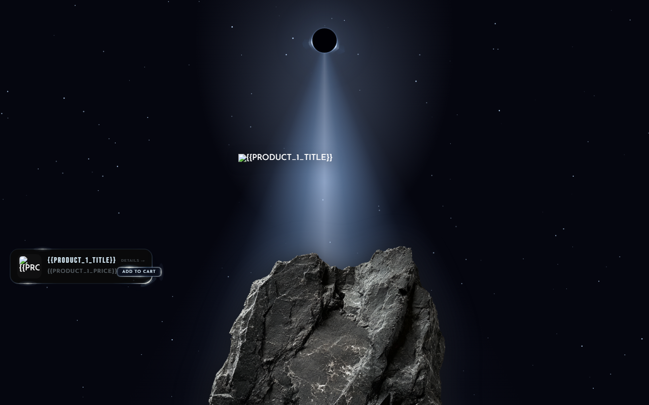
- Eclipse — a single product levitating in a star-field eclipse reveal, with variant pills and add-to-cart in-frame.
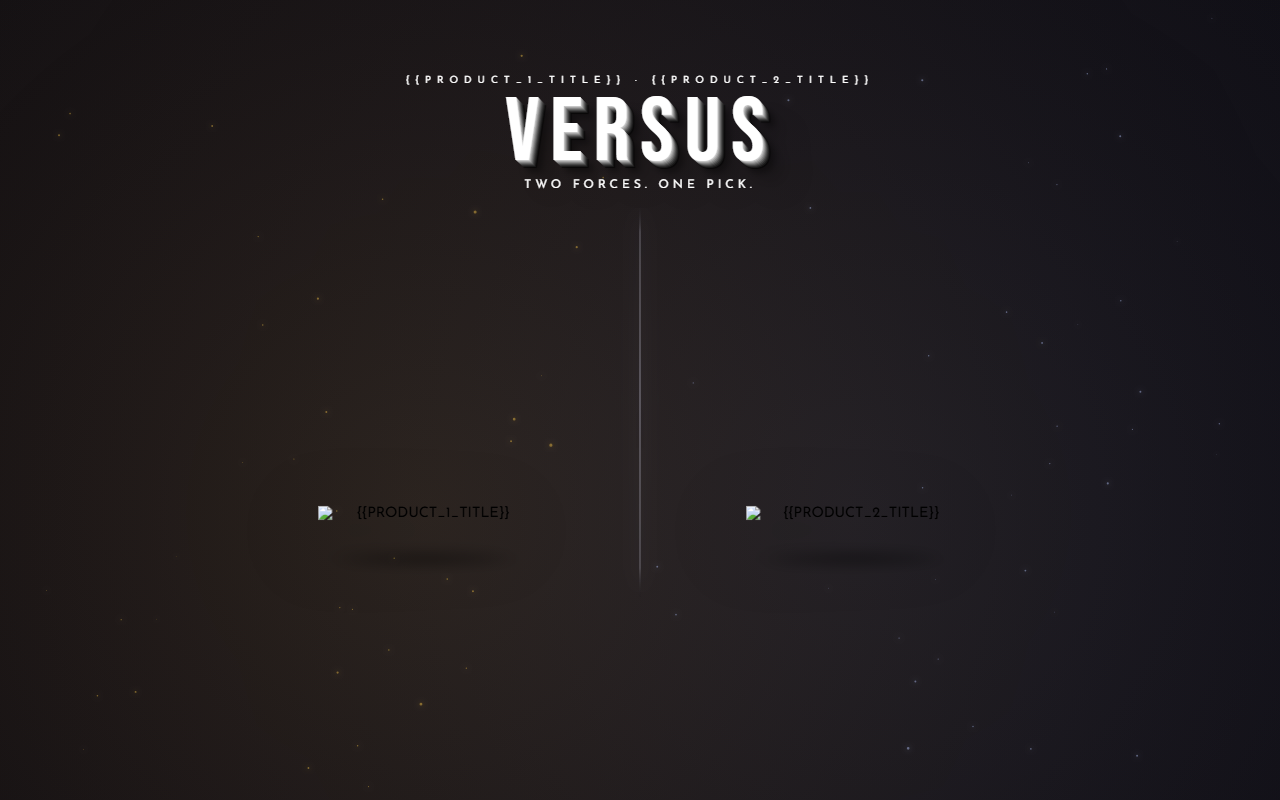
- Versus — two products in a split arena; the side the cursor favors comes alive.
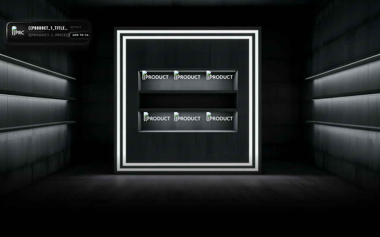
- Universal — one hero, up to six products, each with its own reveal.
FAQ
What is a hero section in Shopify? The full-width section at the top of a page — the first block visitors see. In Online Store 2.0 themes it's a swappable theme section, so you can replace it without changing anything else.
How do I add a hero section to my Shopify store? Theme editor → Add section. For a designed, animated hero: install a section app built as a Theme App Extension (like VOIDD), then add its section the same way and pick your product. No code needed.
Do animated hero sections slow down a store? Only badly built ones. Canvas + CSS animation that starts after the hero paints has negligible cost; autoplay 4K video and heavy WebGL are what tank Core Web Vitals. Ask any section app what its bundle weighs.
Can I show variants and sale prices inside the hero? With a product-aware section, yes — variant switching, live price, sale price with the struck-through original, and add-to-cart, all in the hero. That's the difference between a banner and a selling section.
What size should a Shopify hero section be? Think aspect ratio, not pixels: 16:9 on desktop, 9:16 on mobile, and never sized with vh units (iOS Safari makes them oscillate). Good sections handle both layouts for you.
What is the best Shopify hero banner size? 1920 × 1080 px (16:9) for desktop and a separate 1080 × 1920 px (9:16) crop for mobile, compressed under ~500KB. Themes crop to the section's aspect ratio, so keep critical content in the center ~60% of the frame.
Is a hero banner the same as a hero section? No. The banner is the image you upload; the section is the theme block that displays it and carries the headline, CTA, pricing, and motion. Most hero problems are section problems — a better image inside a static template is still a static template.